介绍:
1. So back in 1977, Steve Jobs turned to an ad agency to design asimple logo that could be printed on their computers, since the original hand-drawn logo of Issac Newton under an apple tree was a little too complicated. Rob Janoff was assigned to the project, and Jobs gave him just one request, saying, “don’t make it cute.”
2. With that in mind, Janoff began working on the logo. He decided to focus on the imagery of an apple instead of the typography, which was a different approach than other computer companies like IBM and Hewlett Packard, whose logos were primarily text based.
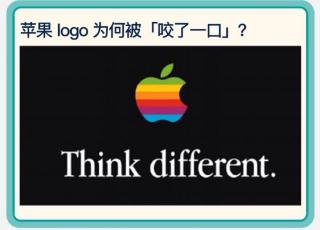
3. Janoff started with a simple silhouette of an apple with a leaf on top. But this imagery was pretty ambiguous, since there are several fruits that have a round shape with leaves stemming off. So to solve these problems, Janoffadded a bite, which allowed people to immediately identify the logo as an apple, while still retaining a simplistic design.
4. Finally, six colorful stripes were added to symbolize the Apple computer’s ability to display color images, something no other machine could do at the time. When Janoff presented the logo, Jobs simply said, “Okay, that's nice.” And made it the official logo of the company.
早在1977年,史蒂夫·乔布斯求助于一家广告公司,希望设计一个可以印在电脑上的简单标志,因为原来手绘的苹果树下的伊萨克·牛顿的标志有点太复杂。罗布·贾诺夫被指派到这个项目,乔布斯只给了他一个要求,说:“不要设计得很可爱”。
考虑着这一点,贾诺夫开始了标志的设计工作。他决定把重点放在苹果的图像上,而不是排版上,这与其他电脑公司如 IBM 和惠普的标志不同,他们的标志主要以文字为主。
贾诺夫一开始设计了一个简单的苹果剪影,上面有一片叶子。但这个图像相当具有混淆性,因为有多种水果的形状是圆形的,上面有叶子。因此,为了解决这些问题,贾诺夫添加了一个咬痕,这让人们能够立即识别标志是一个苹果,同时仍然保留了一个简单的设计。
最后,加入了六条彩色条纹,象征着苹果电脑能够显示彩色图像,这是当时其他机器无法做到的。当贾诺夫呈现这个标志时,乔布斯只说了句:“好的,这很好。”并将其指定为公司的官方标志。

